Looking for a way to improve your website’s user experience and rank higher on search engines? Our expert responsive web design services can help! With a responsive website, your site will adjust to any screen size, making it accessible and easy to use for all visitors. Say goodbye to slow load times, overlapping elements, and frustrated visitors – Contact us now for responsive.website development and redesign services.
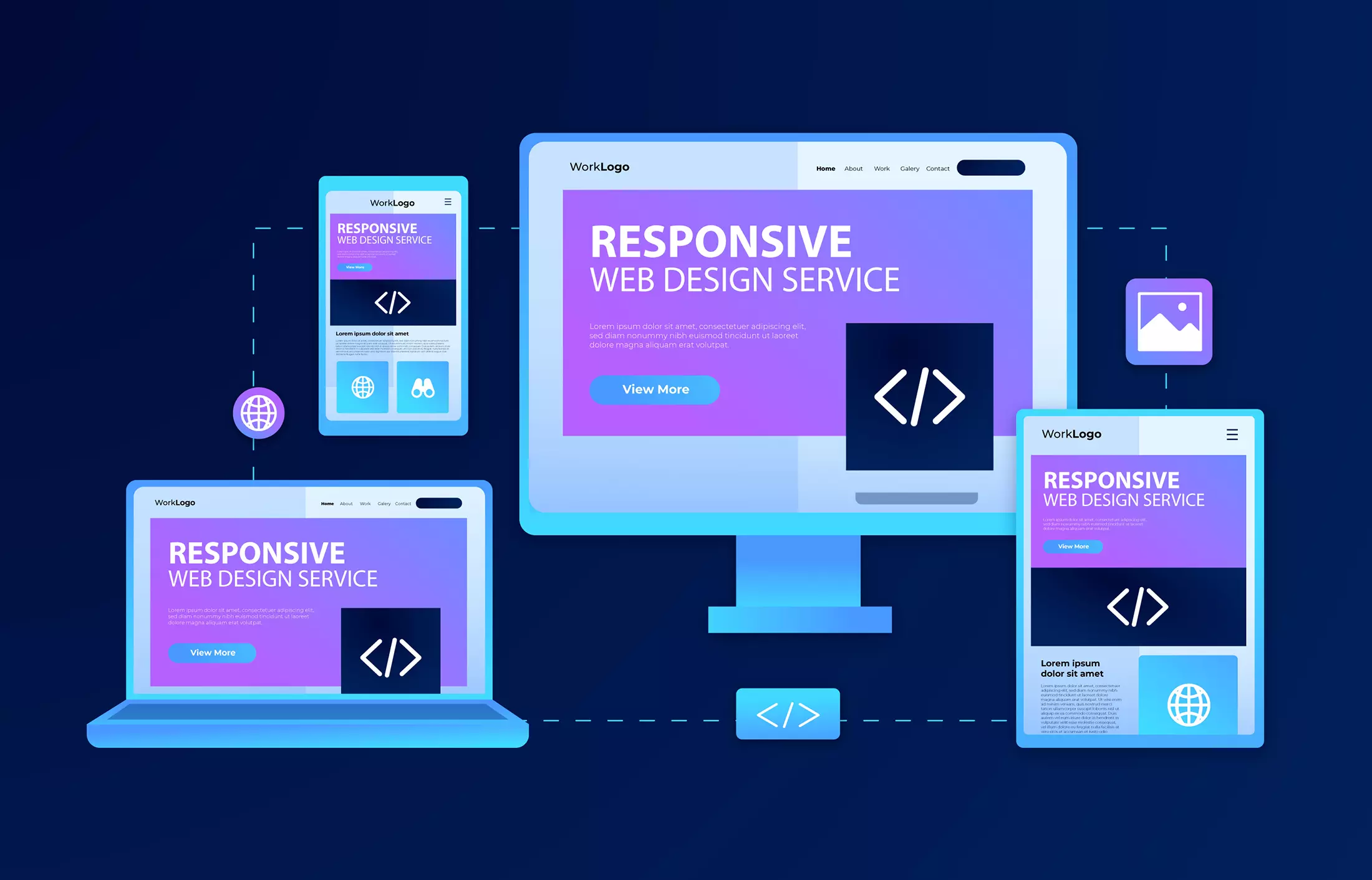
Responsive web design is a design approach that ensures a website looks great and functions seamlessly across all devices, including desktops, laptops, tablets, and smartphones. The design adapts to the screen size, orientation, and platform of the device, ensuring an optimal user experience. This means that users can access your website from anywhere, at any time, on any device, without having to zoom in or out or scroll left and right.
The Benefits of Responsive Web Design
Improved User Experience: Responsive web design ensures that users have a seamless browsing experience, no matter what device they are using. This means they will spend more time on your website, which can lead to increased engagement, more leads, and ultimately more sales.
Better Search Engine Rankings: Google favors responsive web design websites, as they provide a better user experience. This means that responsive websites are more likely to rank higher in search engine results pages (SERPs), which can lead to more traffic and more business.
Lower Bounce Rates: A bounce rate is the percentage of users who leave your website after viewing only one page. With responsive web design, users are more likely to stay on your website and explore multiple pages, which can lead to lower bounce rates.
Why Your Website Needs Responsive Web Design?
As the world becomes increasingly digitized, businesses need to ensure their online presence is accessible to all devices, including mobile phones, tablets, and laptops. Responsive web design allows websites to adjust their layout and content to fit any screen size, making them accessible and easy to use for all visitors.
Responsive web design has become an essential component of website development in recent years. Not only does it improve user experience, but it also helps websites rank higher on search engine results pages (SERPs). Therefore, if your website is not responsive, it is time to consider investing in responsive web design services.
The Problem with Non-Responsive Websites
Non-responsive websites pose several challenges for users. Firstly, they are challenging to navigate on mobile devices due to the smaller screen size. Visitors have to zoom in and out, scroll sideways, or squint to read the text, which can be frustrating and time-consuming.
Secondly, non-responsive websites often have slower load times, which can lead to visitors abandoning the site altogether. A slow website not only affects user experience but also impacts SEO.
Lastly, non-responsive websites may not display correctly on different screen sizes, causing elements to overlap, disappear or become distorted, leading to a poor user experience.
The Consequences of Non-Responsive Websites
The consequences of having a non-responsive website can be severe. Visitors may become frustrated with the site’s functionality and choose to leave, leading to a high bounce rate. High bounce rates negatively impact a website’s ranking on search engines, as they signal to search engines that the website does not meet users’ needs.
Non-responsive websites also lose potential customers. In a world where mobile devices are becoming the norm, websites that are not responsive risk losing out on a significant portion of their target audience.
Expert Responsive Web Design Services
The solution to all of these issues is responsive web design services. A responsive website ensures that the website looks great and functions seamlessly on any device. Responsive design adjusts the website layout, images, and text to fit the screen size, ensuring that all elements are easy to read and navigate.
Investing in expert responsive web design services also improves a website’s load time, leading to better user experience and higher rankings on SERPs. A responsive website ensures that all visitors have a positive experience, increasing the chances of visitors becoming customers.
Mobile-friendly websites – Websites that are designed to be easily navigable on mobile devices.
User-friendly websites – Websites that are designed with the user’s experience in mind, making it easy to navigate and find information.
Responsive web design agency – A company that specializes in designing and developing responsive websites that work on all devices.
Screen size optimization – The process of optimizing a website’s layout to fit different screen sizes, ensuring that all elements are easy to view and navigate.
Cross-device compatibility – The ability of a website to function and display correctly on different devices, such as desktops, laptops, tablets, and mobile phones.
Mobile-first design – A design approach that prioritizes the mobile experience and creates a responsive website that is optimized for mobile devices.
Multi-device compatibility – A website that works well on different devices, including desktops, laptops, tablets, and mobile phones.
Mobile web design – The process of designing and developing websites that are specifically optimized for mobile devices, such as smartphones and tablets.
FAQ
What is responsive web design?
Responsive web design is an approach to website design and development that allows a website to adapt to the user’s screen size and device, creating an optimal viewing experience. The website’s layout, images, and text adjust dynamically to fit the screen size, making it accessible and easy to use on any device.
Why is responsive web design important?
Responsive web design is important because it ensures that a website is accessible and user-friendly on any device, regardless of screen size. With more people accessing the internet through mobile devices, having a responsive website can lead to higher engagement, lower bounce rates, and increased conversions. Additionally, responsive web design is a ranking factor for search engines, meaning it can improve a website’s SEO performance.
Can I make my existing website responsive?
Yes, you can make your existing website responsive by engaging a web design and development agency that specializes in responsive website redesign. The agency can analyze your current website and make the necessary changes to ensure that it is optimized for all screen sizes and devices.
Will a responsive website increase my website’s load time?
No, a responsive website should not increase your website’s load time. In fact, a well-designed responsive website can improve your website’s load time by optimizing images and content for faster loading on mobile devices.
How can I ensure that my website is mobile-friendly?
To ensure that your website is mobile-friendly, you can use tools such as Google’s Mobile-Friendly Test or engage a web design agency that specializes in mobile-first design and responsive web design. These tools and agencies can help you analyze your website’s responsiveness and make the necessary changes to optimize it for mobile devices.